The Image Item allows you to upload and add images to your page. Various styling and customizable settings will be available once an image is uploaded and selected.
Item Settings
Choose Image
This button will allow you to upload or change an existing image. The item settings for an image will appear once an image has been selected.
Image Description
The image description (also known as the 'alt' tag) provides 'alternative information' for an image if a user for some reason cannot view it (because of slow connection, an error, or if the user uses a screen reader
Image Title
The title for the image that will be displayed when you hover your mouse over the image.

Alignment
Set the alignment of the image to either left, center or right. By default, alignment is set to 'center.'
Image Style
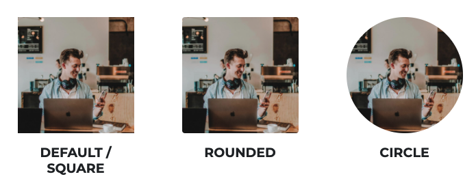
Change the image style by adding rounded corners or making the image a circle. Note that the 'circle' option works best with a perfectly square image as shown below.

Width
Set the image width as a percentage of the block that it is in. You can set the image width for each of the device sizes like desktop, tablet and mobile.
Max Width
You can also set the maximum width of an image in pixels. This is very helpful to control how big an image can get (like sizing a logo, or a testimonial head shot).
Drop Shadow
This setting ads a drop shadow to an image to help it stand out by making it appear as though it is coming off of the page. Choose between small, medium and large.
Click Action
This setting allows you to add an action to the image if a user clicks on it. Very similar to clicking on a button, you can choose from multiple options like opening a popup, or sending the user to a different page.
Spacing Settings
-
Outside Spacing
Changing these settings will add space to the OUTSIDE of an item. -
Inside Spacing
Changing these settings will add space to the INSIDE of an item.
These spacing settings can be adjusted for all 3 device sizes, allowing you to have more control over your page on both desktop and mobile devices.